Tagged: infographic

Breakfast From Around the World

Today’s infographic explores more than just bacon and eggs. It gives us a look at dining tables of breakfast eaters from around the world. Australians apparently prefer a brown spread called Vegemite on their toast in the morning; the Japanese enjoy soy beans on rice; the Moroccans like lamb stew; and Argentineans frequently sip Yerba Mate–a delicious, highly caffeinated tea.

Go ahead, dig into today’s delicious infographic, and have a great rest of your day!

How Much Sugar Do Americans Consume?

Within that routine comes the consumption of sugar and if you’re not careful, you might be over consuming without even knowing. The statistics in this infographic, created by OnlineNursingPrograms.com reveals the absurd amount of sugar consumed by Americans daily and annually and the results, while not shocking, make you want to throw up the mocha, caramel frappachino you’re drinking while reading this. Sugar has been linked to some common diseases you may be familiar with such as diabetes, obesity and hypoglycemia, but also have been linked to tension, fatigue and even cancer.

An Enlightening History of the Hashtag

Ever wondered where the hashtag came from? It’s popularity has now spread across almost every social platform and is now a way to find, categorize and search for keywords. This infographic tracks the hashtag from the very beginning to becoming the corner stone of social tagging.

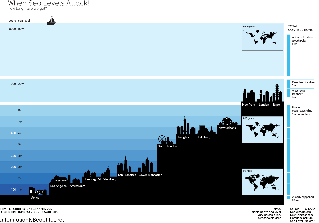
When Sea Levels Attack!

Climate change is happening whether you like it (believe it) or not. The world is already 71% water–it doesn’t seem too outrageous to believe that melting ice might up the anty on that number majorly. Please, just watch Chasing Ice, it more than clearly shows the astonishing amount of ice that has been (and will be) falling into the sea everyday.