Interesting Maps They Didn’t Teach You At School
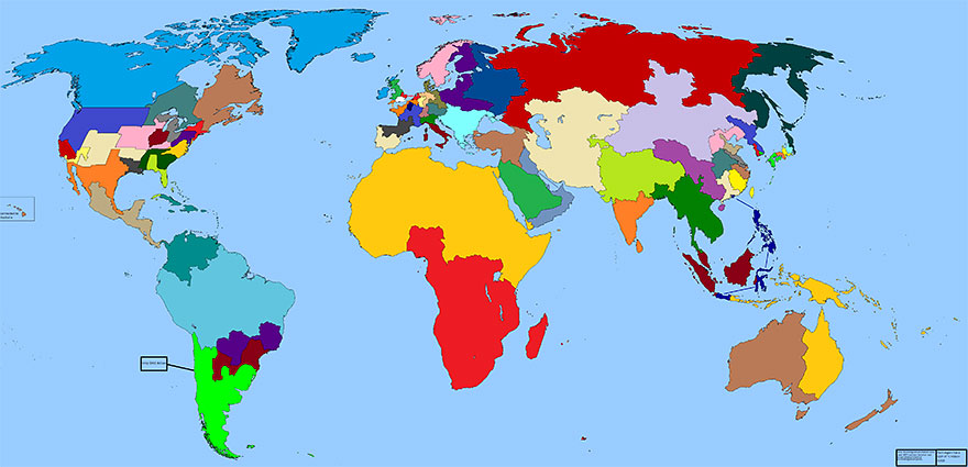
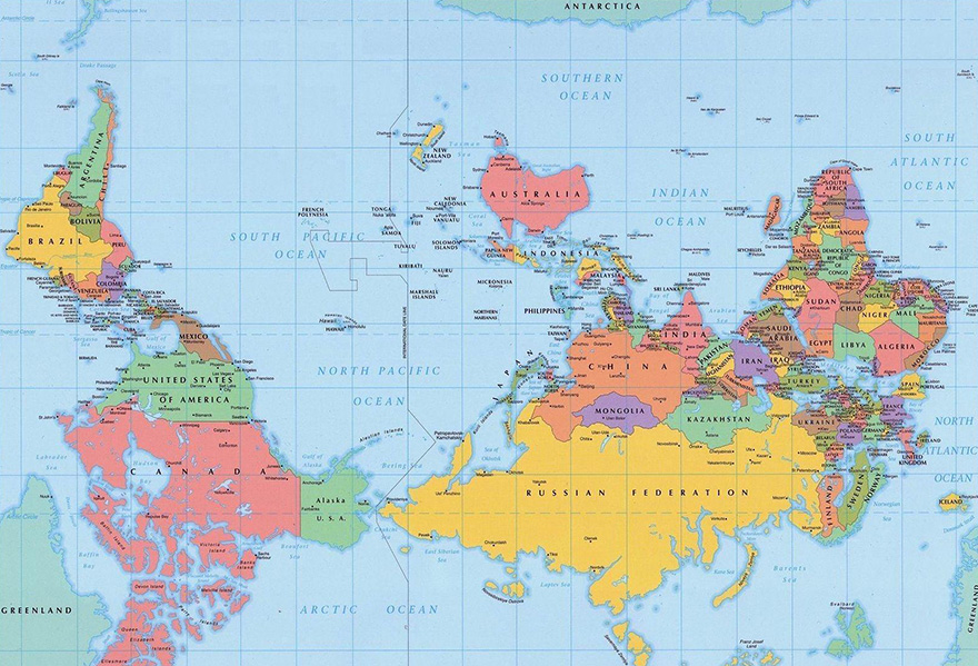
When we collected a list of maps that will blow your mind, you totally loved them, so we’re back with more. Using infographical maps to represent data is nothing new, so it’s no surprise that people are always coming up with new ways to use them to display information. It’s the best way to illustrate the economic, social and cultural differences between different parts of the world.
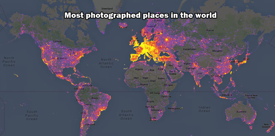
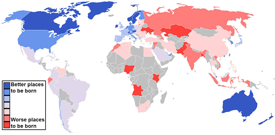
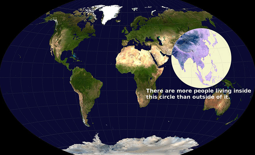
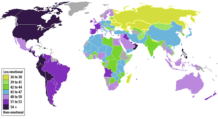
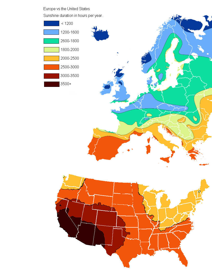
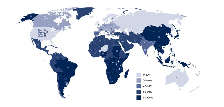
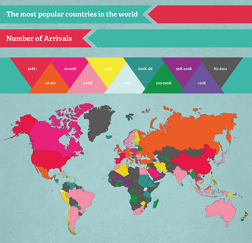
So, have you ever wondered where in the world the most and least photos are taken? How is the human population or economic production distributed across the globe? These maps – some of which are new and some of which are old favorites – answer questions like these in an intuitive way.
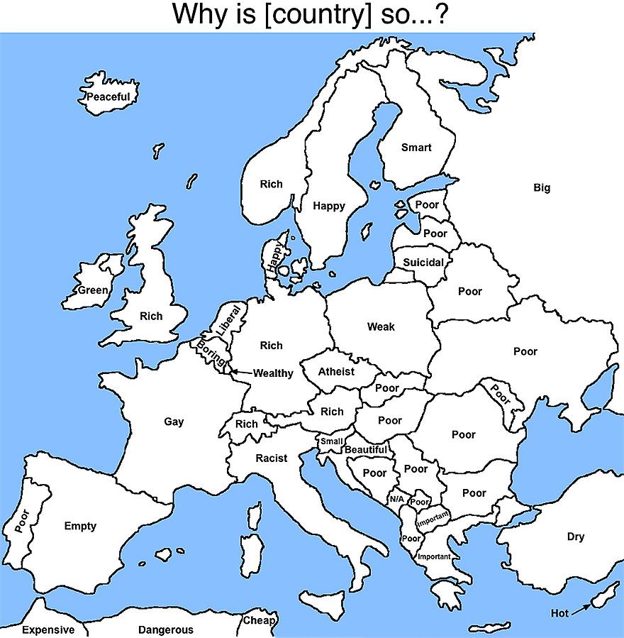
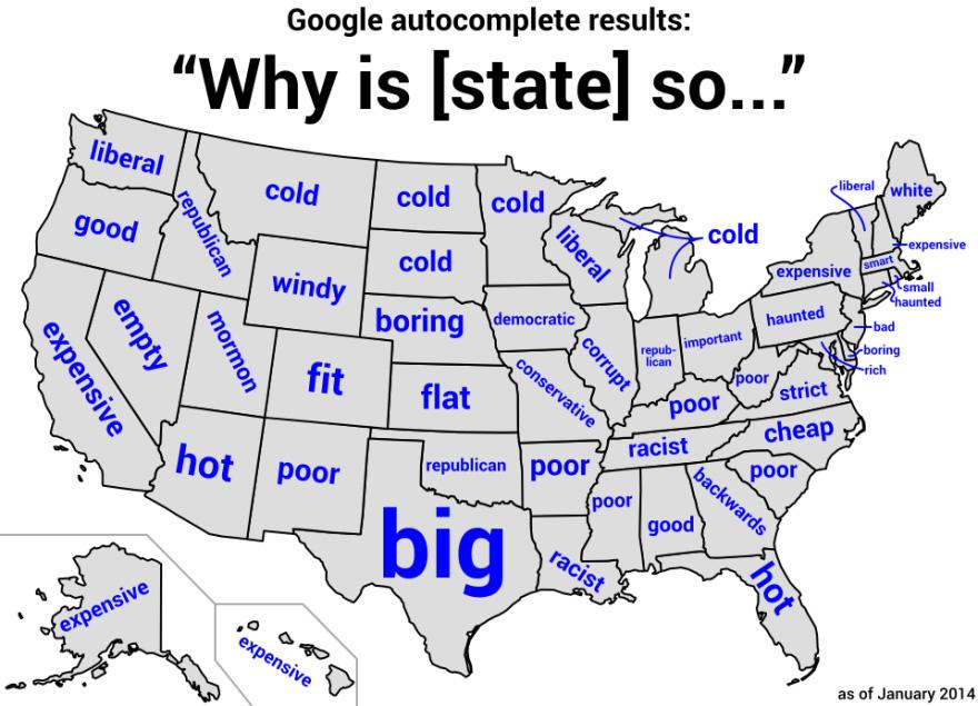
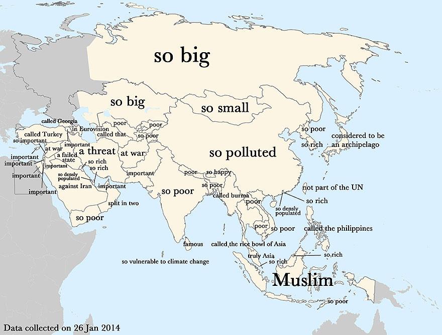
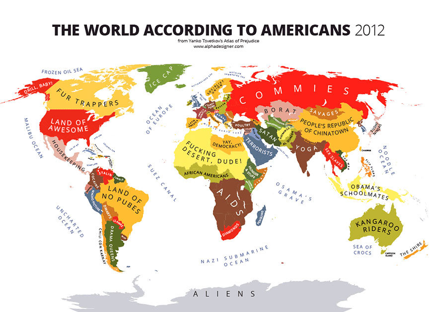
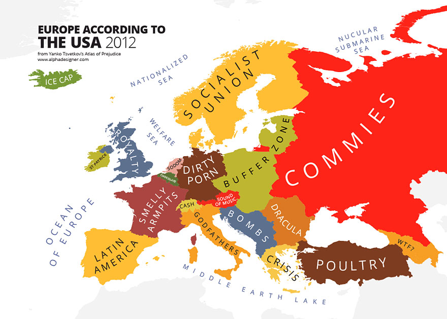
If you like what you see, check out also the stereotype maps that label nations and geographical regions by the stereotypes through which they are perceived by the map’s primary subject.